YouTube Music gets more social, adds comments to the ‘Now Playing’ screen
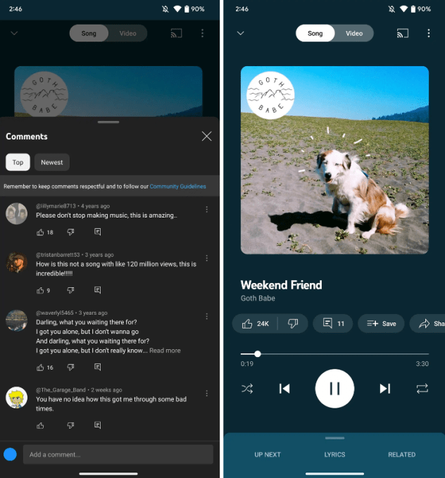
YouTube Music redesigned its “Now Playing” screen recently, with the most notable update being a new comments section, which allows users to read and write comments directly from the app. The latest upgrade also includes easily accessible buttons, larger cover art and more.
The redesign is rolling out to iOS and Android devices today, per a company spokesperson.
As spotted by 9to5Google, YouTube Music launched a new comments button that shows existing comments from the official music video on YouTube. Users can also type their own, which adds a more engaging social component to the app.
The comment button is located under the cover art. When a user selects the button, a panel slides up on the screen.
Next to the comments are icons for like/dislike, save, share, download and radio, which were previously hidden and only accessible when users tapped on the album cover. Moving the buttons underneath the title of the song makes it easier to access.
Another small change is that the song/video toggle is now white instead of matching with the background color.
The redesign follows the launch of “Samples,” YouTube Music’s new TikTok-style short-form personalized video feed that features YouTube’s catalog of official music videos as well as live footage.

