iPhone 15 Pro Max review
I fell asleep with my phone again. I know it’s bad for me, but work trips will do that to you. The next morning, bleary-eyed, I went to plug it in, spending a confused few moments wondering what had gone wrong. I was attempting to plug a Lightning cable into an iPhone 15. Perhaps I’m the first person to have done this — but I almost certainly won’t be the last. The next year will be littered with creatures of habit trying to brute force a phone charger.
As phone problems go, this is a good one to have. USB-C was undoubtedly the star of last week’s show. Apple could have introduced a levitating phone that projects that weird chess game they play on the Millennium Falcon, and all anyone would talk about would be the new port.
Understandable. This is a new era. Lightning lives on in a handful of Apple products, like AirPods, Magic accessories and an iPad, but those are mere death rattles for a connector that should have been phased out years ago. Apple has always been a booster of proprietary products, so it followed that the company would design and release its own connector. When it was released 11 years ago, a strong case could be made that Lightning was a better option that micro-USB.
It cannot, however, hold a candle to USB-C. Released in January 2015, the Nokia N1 tablet was the first consumer device to support the standard. The first USB-C-enabled smartphone followed a few months later. But Apple users have spent the last eight years packing Lightning cables, getting lint caught in the connector and wearing down the exposed pins from too many connections. It’s true that such connections have grown less relevant in the days of wireless charging, but this was some expert stubbornness, nevertheless.
The arrival of USB-C on the iPhone is good thing. Full stop. It’s a great standard, and it’s great to have a universal charging port. It’s certainly true that last year’s EU legislation forced Apple’s hand here, but regardless of the cause, it’s a good outcome for consumers, even if they spend the occasional early morning wondering why their charging cable won’t plug into their phone.
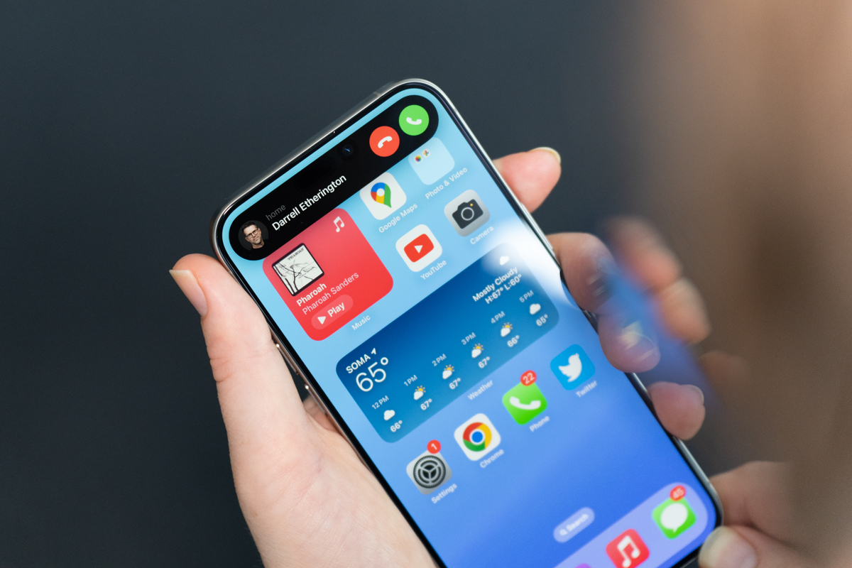
Image Credits: Darrell Etherington
The Pro models sport USB 3.2 Gen 2 speeds, while the standard iPhone 15 and 15 Plus are stuck at USB 2. The distinction is even more pronounced than it initially appears. The former supports data transfer rates up to 10 Gbps, and the latter around 480 Mbps. Why the difference? The cynic in me says it’s another spot to draw the value prop line between products. As things like Dynamic Island get standardized across the line, elements like this can help justify the price gulf between products.
Interestingly, despite Intel’s introduction of Thunderbolt 5 the same day the iPhone 15 dropped, the standard was nowhere to be seen at the Apple event. Not that anyone was expecting the new version’s ridiculous 120 Gbps transfer speed, but rumors about Thunderbolt 3, which tops out at 40 Gbps, were floating around leading up to the event. Thunderbolt had exclusively been a Mac thing inside the Apple ecosystem, but recent iPads have made the jump from USB-C to Thunderbolt, so the iPhone didn’t seem entirely out of the realm of possibility. Maybe next year. Meantime, this is a big increase for the Pros, as Lightning capped out at USB 2 speeds.
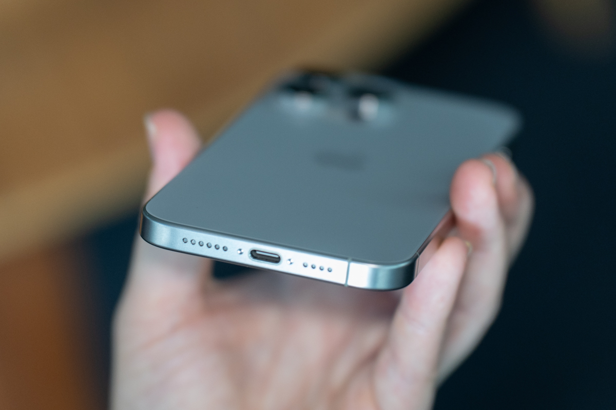
Image Credits: Darrell Etherington
Certainly, the case can be made that USB 3.2 Gen is a “pro” feature here. While what defines “professional” in this context isn’t always clear, such transfer speeds are appealing to those who plan to do a lot of content capture. As Apple notes in its press material, “a new USB controller enables USB 3 speeds on iPhone for the first time, now supporting much higher transfer speeds and video output up to 4K at 60 fps HDR.” It’s fascinating to go from several years of discussing wireless everything to talking about wired transferred speed, but legitimate professional content creators are looking to their handsets as a viable option as the number of music videos and movies shot on these devices increases.
An important caveat to all of this was quickly pointed out by sites like ours in that the Pro models don’t give you USB 3 speeds right out of the gate — or, rather, their cables don’t. The one that comes in the box will give you a similar USB 2 speed. While Apple won’t be making its own USB 3 cable, you can pick one up for around $30, like this braided one from Anker. My suggestion is to take the one in the box for a spin. If those speeds are enough for you, great (again, they’re comparable to Lightning). If not, pick up a new cable and don’t get it mixed up with the others.
Late last year, a friend asked me whether she should upgrade her iPhone. I told her to wait until the new one. I wasn’t under any illusions that the line was getting a complete overhaul, but USB-C was enough reason to avoid upgrading for several months. The port is — of course — just one of the new features contained herein. One can’t really argue that the iPhone 15 is as radical a departure as the iPhone X was half a decade prior — in a lot of ways, we’re still very much living in the iPhone X era. But there’s plenty to like here.
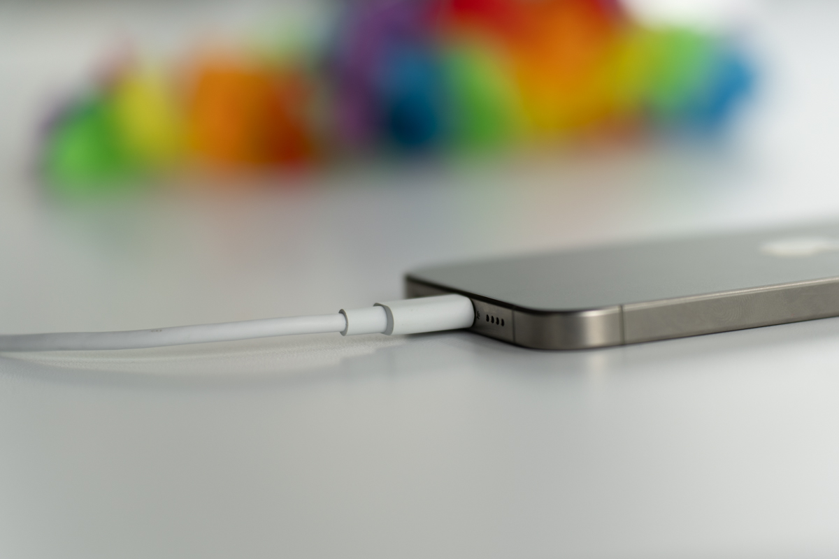
Image Credits: Darrell Etherington
I’ve been living with the iPhone 15 Max Pro as my primary device for the past several days. It’s a truly premium device. The appeal of an “aerospace‑grade” titanium frame is immediately clear. The metal has an ideal strength to weight ratio — so much so you’ll wish that other iPhones followed suit. But the other defining characteristic if titanium is price. It’s roughly $20/kg, versus aluminum’s $2/kg. Aluminum is also the lighter of the two metals, but titanium’s strength means you need less of it to create structural integrity.
As someone who has spent most of the past year carrying around an iPhone 14 Pro, the weight differential is absolutely noticeable. The 14 Pro and Pro Max are heavy phones for their size, at 7.27 and 8.47 ounces. Their replacements, on the other hand, run 6.6 and 7.81, respectively. Greg Joswiak referred to the devices as the “lightest Pro models ever.”
When Apple says “aerospace-grade” titanium, it’s specifically referring to Grade 5. It’s actually an alloy that also includes aluminum, vanadium and iron, commonly referred to as the “workhorse” of aerospace. It shows up in “structural components, but it is also used in high-performance engine parts, sports equipment biomedical implants, and more,” according to the Titanium Processing Center.
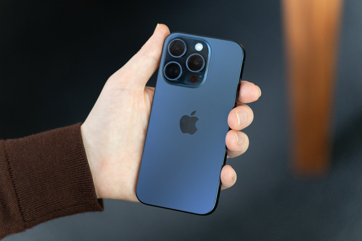
Image Credits: Darrell Etherington
Along with its much-touted strength-to-weight ratio, it’s also celebrated for corrosion and heat resistance, as it’s able to withstand temperatures of up to 600 degrees Fahrenheit (326 c). Hopefully you’ll never be in a position to test that last bit. The material was a no brainer for the original Apple Watch Ultra, owing to both the product’s size and extreme environments it’s designed for.
It’s something the company has been working on for much longer. Apple has titanium patents dating all the way back to 2017. Last year, the company was granted a patent for a “Titanium part having an anodized layer.” That filing specifically pertains to the way the company has integrated color into the handset.
Apple sent a Pro in Blue and Pro Max in Natural Titanium. The palette is relatively drab, placed against the pinks and greens of the standard 15 models — but that’s been the model since the iMac and iPod days. The lower-cost devices get bright, playful colors, while the higher-end models come decked out in a more muted scheme because, one assumes, they mean business. That’s not to say, of course, that they’re dull — especially this time out, as the company has done some interesting color work.
The colors really sing when the light hits right. In the case of the blue Pro model, the color is so dark as to be imperceptible in certain environments. Catch some sunlight, and the color radiates through the back glass, with a bright flash in and around the transparent camera bump. As the name implies, Natural Titanium is the alloy’s untreated color. It’s a soft, nearly white silver covered in a frosted glass finish. The Apple logo is highly reflective — a scaled-down version of what you get with the latest MacBooks.
Catch up on all of our Apple Event 2023 coverage here.
The sides are an even purer metallic, brushed and machine rounded. It’s a nice contrast of colors that play well off each other. Having seen all of the colors in person, I would go with Natural Titanium. It’s a subtle mixture of softness and metal that’s industrial, but still welcoming. It also doesn’t collect fingerprints as readily as the blue — though you’ll still see some around the handset’s frame.
This is the point where I should confess that I’m a phone case person. I can talk all day about the back glass, but I will rarely see it. The truth is, I’m clumsy. I admit it. I bump into things and drop stuff. I’ve never fully shattered a phone screen, but I’ve seen enough people attempt to use their phones through the cracked spiderwebs to understand the value of forming a bumper around the device’s perimeter. Of course, phone materials continue to get stronger, so perhaps some day I’ll change my tune. But not today.
Thankfully, the company included a Pacific Blue Fine Woven case. The sides are a harder plastic, presumably to offer more reinforcement where the device needs it the most. The back is made of a “durable microtwill” that brings a nice velvety/suede feeling that’s soft to the touch. Word of caution: it scratches easily. I’ve only had the phone for a few days, and the marks have begun to show from my hands, the contents of my pockets and the MagSafe wallet that snaps to its back.
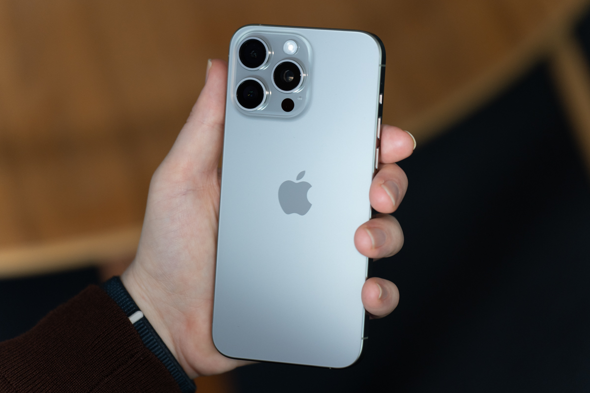
Image Credits: Darrell Etherington
My biggest issue with the case at the moment is that it doesn’t lie flush with the phone’s screen. It’s like a practical choice for added protection, so the screen doesn’t rest directly on a surface when placed faced down. However, if you want to answer a phone call the old-fashioned way (i.e. without headphones), it’s harder to get the speaker directly next to your ear.
The front glass is made from Ceramic Shield, which was introduced to the line a few years back via the iPhone 12. The material, which is produced by Corning (the same folks behind Gorilla Glass), gets high marks for both stretch and scratch resistance. Apple describes the process thusly:
The new material was enabled by a high-temperature crystallization step which forms nano-crystals within the glass matrix. Those specialized crystals are kept small enough that the material is transparent.
Apple liked the material so much it awarded Corning $45 million from its Advanced Manufacturing Fund, back in 2021.
I can easily get my hand around the device. Not something I can confidently say with every 6.7-inch handset. Your mileage (hands) will vary, of course. We still can’t call it an edge-to-edge display. The black bezel still runs around the display’s edge, but it is perceptibly thinner on the Pros. Rather than increasing screen size, Apple has used the opportunity to trim down the device’s footprint by a few fractions of an inch.
The 15 Pro Max measures in at 6.29 x 3.02 x 0.32 inches to the 14 Pro Max’s 6.33 x 3.05 x 0.31. That’s not a huge gulf, but anytime you can reduce the phone to screen ratio, that’s a net positive. In fact, the 15 Pro Max is smaller than the 15 Plus’ 6.33 x 3.06 x 0.31 inches (though the 15 Plus remains lighter at 7.09 ounces, owing to the camera hardware). The 15 Pro, meanwhile, measures in at 5.77 x 2.78 x 0.32 inches to the 14 Pro’s 5.81 x 2.81 x 0.31 inches.
The other notable upgrade to external hardware is the addition of the “Action button,” which, much like titanium, was inherited from the Apple Watch Ultra. The more these similarities pop up, the more you wonder why Apple ultimately avoided the brand synergy of releasing the device as the iPhone 15 Ultra (but I’ll happily defer to Apple’s marketing team on that one). The addition is also notable for what it replaced. The mute switch has been part of the iPhone line since day one.
For my money (and most of the colleagues I’ve spoken to), it’s not a big loss. But change is hard, and Reddit is rife with melancholy eulogies for the switch. The fact is that a relatively small subset of folks have been dreading the loss of the switch for years now with the seeming impending arrival of a solid state button (that is, buttons that don’t actually physically move when you press them). Apple was rumored to be moving to entirely solid state buttons with the 15, but apparent production issues got in the way. They do, however, seem likely for the 16, but let’s not get too far ahead of ourselves here.
One of the arguments I’ve read in favor of keeping the mute switch is the true tactile and visual confirmation. Again, I suspect people mourning its loss are very much in the minority. Of course, I’m somewhat biased as someone who immediately switches all of my devices over to silent mode the minute they’re unboxed. I’ll usually forget about it until the inevitable time I have to remove the case, trigger the switch and get completely flummoxed when my phone starts making noises.
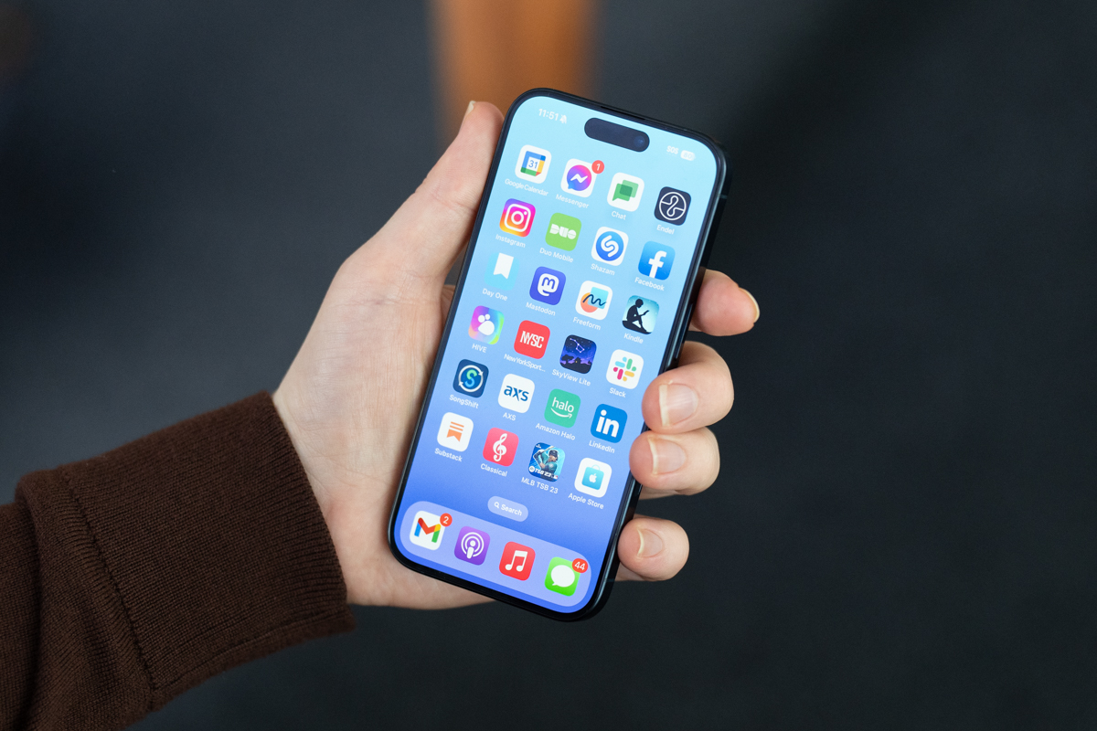
Image Credits: Darrell Etherington
The concept of a customizable button isn’t new, of course. Samsung backed into a version of it on the Galaxy S series after customer annoyance around the Bixby button. Phone buttons are so few and far between these days that it seemed silly to keep one around whose only purpose is prompting a smart assistant that most people aren’t using anyway. Thankfully, the company eventually added the ability to remap the button to different apps.
And then there’s the Action button’s namesake on the Apple Watch Ultra. The feature makes a lot of sense on a smartwatch. After all, companies are constantly looking for new ways to let users interact with the small screen. Take, for example, the Series 9’s Double Tap feature, which leverages a variety of sensors to trigger actions by tapping your index finger and thumb together twice.
Otherwise, you have to navigate through a few layers on a fairly small screen. The Watch Ultra surfaces Workouts, Stopwatch, Waypoints, Backtrack, Dive, Flashlight and miscellaneous shortcuts as options. When you’re, say, in the middle of a workout, it’s far easier to just tap the big orange button. The iPhone doesn’t have the same screen real estate constraints, of course, but the appeal of firing a commonly used feature by holding down a button is still clear. There’s a reason, after all, the company added flashlight and camera shortcuts to the lock screen a few years back.
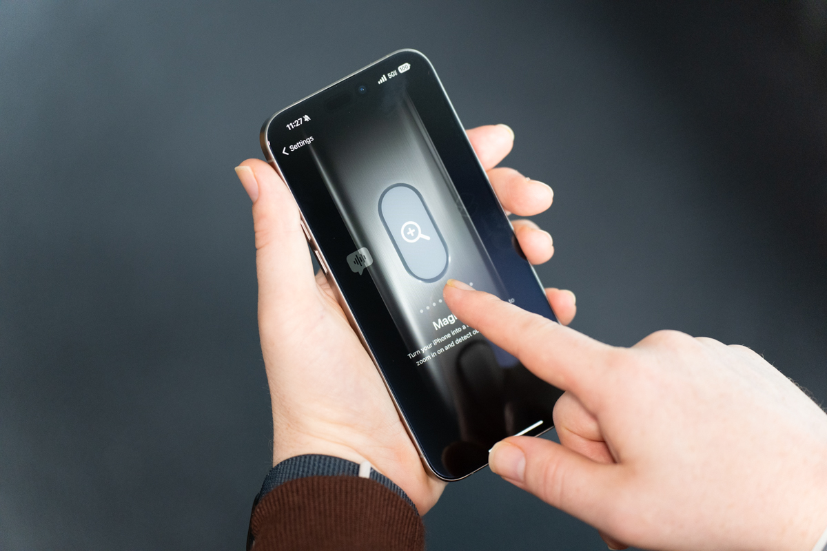
Image Credits: Darrell Etherington
The iPhone’s Action button, fittingly, defaults to mute. If you miss the old switch, you’ve still got that functionality without having to lift a finger. Long-press the button and the phone will toggle in and out of silent mode, with a familiar haptic buzz. Now, you and I both know that even mute switch fans are going to do a little experimentation here to see what the big deal is. Apple’s developed an entire animated interface that lives inside the Settings menu. It’s a odd at first — it’s like opening up a separate app inside of settings. One wonders whether this is a one-off or a sign of things to come with a more dynamic take on settings. It’s easy to imagine the company implementing something similar for, say, Focus or Screen Time.
Tap into action, and you’ll see a static graphic representing the phone’s side. Silent Mode is the default position, with a bright orange overlay representing the feature. The other spots include Focus, Camera, Flashlight, Voice Memo, Magnifier, Shortcut, Accessibility and nothing. You can effectively make it a dead button, if that’s what you want, but what’s the fun in that?
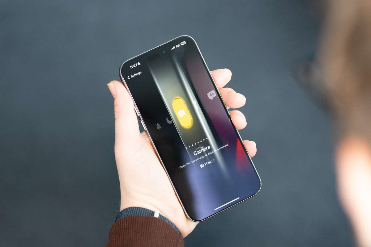
Image Credits: Darrell Etherington
I know a lot of folks who immediately knew what they wanted to do with their Action button the moment it was announced. I’m a bit more indecisive, which is kind of how I roll with these sorts of things. I’ve mostly been alternating between Camera and Voice Memo. I thought I was going to be a Camera guy right out of the gate, but the existence of the camera button on the lock screen has caused me to rethink that mindset.
One cool thing about enabling the Camera feature is that it effectively does double duty. The first long press will open up the camera app from the lock screen. Once in there, it serves as a shutter button. I’ve accidentally photographed bits of my finger more times than I care to mention, so I really appreciate the ability to keep them entirely away and snap photos without having to touch the screen. Underneath the Camera button in Settings you’ll see a drop-down. From there you can decide which mode you want to fire up: Photo, Selfie, Video, Portrait or Portrait Selfie.
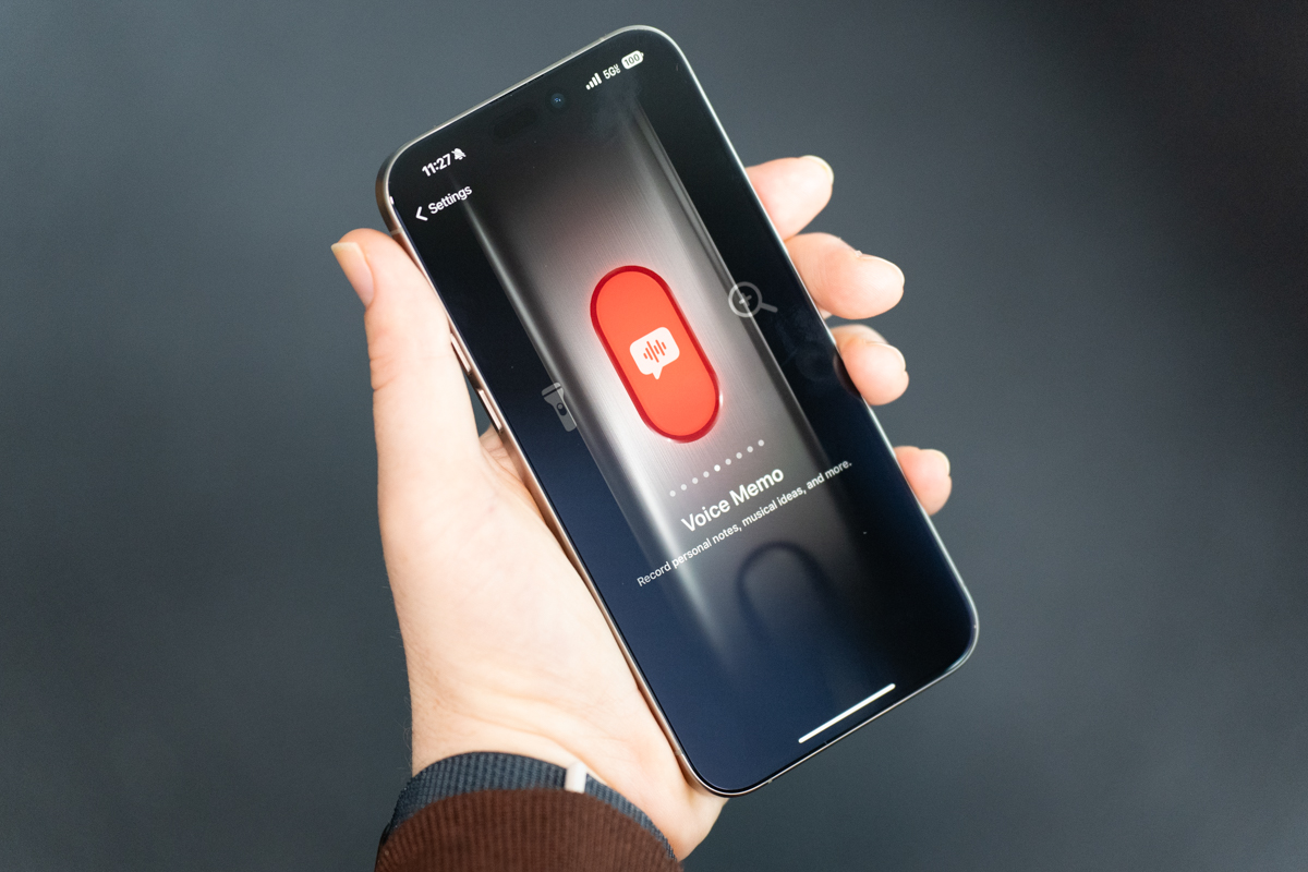
Image Credits: Darrell Etherington
Voice Memo isn’t for everyone, but as a reporter, I love the idea of emulating an old-fashioned tape recorder. Long-pressing the button will not only fire up Voice Memo, it will automatically start recording. If the phone is locked, the feature will show up inside the Dynamic Island, include the waveform and stop button. Focus is fairly straightforward, toggling in and out of the setting with a long press. This one also features a drop-down menu that lets you choose between Do Not Disturb, Mindfulness and Sleep.
Flashlight doesn’t add any additional customization. That one is simply on and off. A brightness slider would be a nice touch. Magnifier fires up an app that’s been around for several years, but that’s one I’ve never spent any time with. It effectively turns your device into a magnifying glass, with a zoom slider in the middle. It’s kind of like the camera app without the camera bit. You can adjust the brightness, toggle between basic color filters and tap into image and text detection.
Turn on Shortcuts and it will bring you to the corresponding app. From here you can use it to fire up different apps. The more I think about it, the more I like tying Shazam to the Action button. The ability to set timers or open up the Notes app might be nice, as well. Apple offers up shortcuts to its main proprietary apps here. The company has also opened access to third-party developers.
It notes under “Best Practices”:
Support the Action button with a set of your app’s essential functions. For example, if your cooking app includes an egg timer, a “Start Egg Timer” action might be one that people want to initiate when they press the Action button. You don’t need to offer an App Shortcut that opens your app, because the system provides this function already. Your app icon, widgets, and Apple Watch complications give people other quick ways to open your app.
For each action you support, write a short label that succinctly describes it. People see your labels when they visit Settings to configure the Action button’s behavior. Create labels that use title-style capitalization, begin with a verb, use present tense, and exclude articles and prepositions. Keep labels as short as possible, with a maximum of three words. For example, use “Start Race” instead of “Started Race” or “Start the Race.”
Prefer letting the system show people how to use the Action button with your app. When you support the Action button, the system automatically helps people configure it to initiate one of your app’s functions. Avoid creating content that repeats the guidance offered in Settings for the Action button, or other usage tips the system provides.
Perhaps the most interesting bit in all of that is moving beyond simply firing up an function and assigning additional actions in-app. Beyond that, anything you can program into shortcuts can be added to the button.
The screen remains unchanged from the last generation. Both Pros sport the Super Retina XDR OLED always-on display with ProMotion (a fancy name for the 120Hz refresh rate). The Pro is 6.1 inches to the Pro Max’s 6.7. That’s a 2556 x 1179 and 2796 x 1290 resolution, respectively. Displays were once one of the primary grounds on which the smartphone wars were fought, but things have seemingly largely plateaued on that front with the major manufacturers, and it’s hard to complain too much.
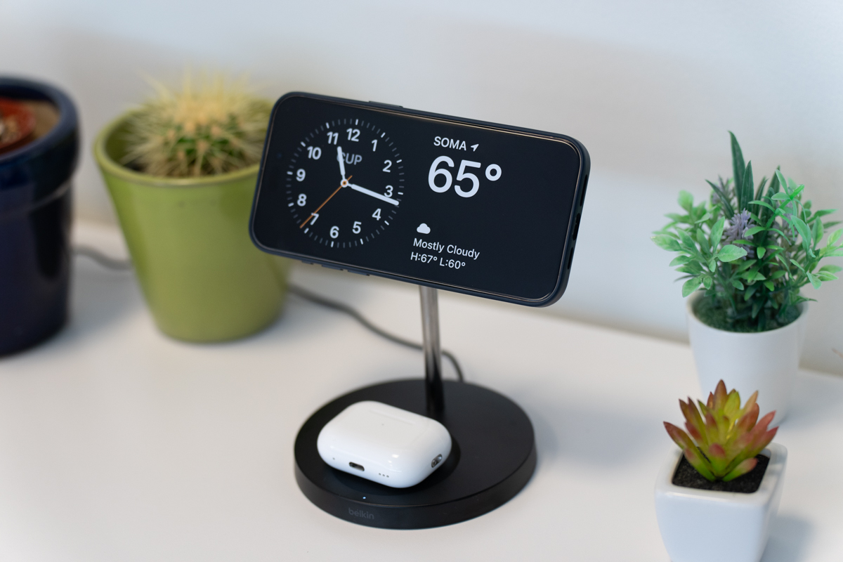
Image Credits: Darrell Etherington
The Always-On display, which was introduced on the 14 Pro models, has given rise to Stand By. The feature, which rolls out with iOS 17, puts the handset to rest when not in use. Apple included a Belkin MagSafe dock to test the feature. Operating it is straightforward. Enable the lockscreen, then place the phone horizontally on the dock. Standby is customizable. I currently have it in the simplest configuration, featuring a clock, the location (down to the neighborhood) and the current weather.
Press down on the screen when in Standby and you can adjust different elements the same way you would widgets on the iPhone’s home screen. There are a bunch of different watch faces, news and photos, among others. The feature is great for nightstands, especially if you’re someone who uses your phone as your alarm. When it gets dark, Standby triggers the same red text night mode you get on the Apple Watch Ultra.
I can’t help but think the company is backdooring its own smart screen technology here, which could prove central to its smart home ambitions.
Apple isn’t in the business of revealing battery capacities, and I’m not quite ready to take a screwdriver to these phones just yet. Thank goodness for regulator databases. What’s interesting is that all of the models appear to have gotten larger batteries. Those are as follows (all in mAh):
- iPhone 3,279 > 3,349
- Plus 4,325 > 4,383
- Pro 3,200 > 3,274
- Pro Max 4,323 > 4,422
Apple didn’t really spend any time on battery during the keynote, likely owing to the fact that all of the increases are quite modest. The new Pro and Pro Max are rated at 20 and 25 hours of video playback, respectively. That’s up two hours on the Pro side, while the Pro Max remains the same. In practical terms, you can safely say “all-day battery life,” and nine more hours than the iPhone 12 Pro Max. I’ve haven’t had an issue getting through a day with moderate use (listening to music, checking emails and looking at all of the social media I know is probably bad for my mental health). Word of caution as someone who has been traveling this week: location tracking services like Uber still do a number on the phone, both in terms of battery life and heating, so quit out of them when possible.
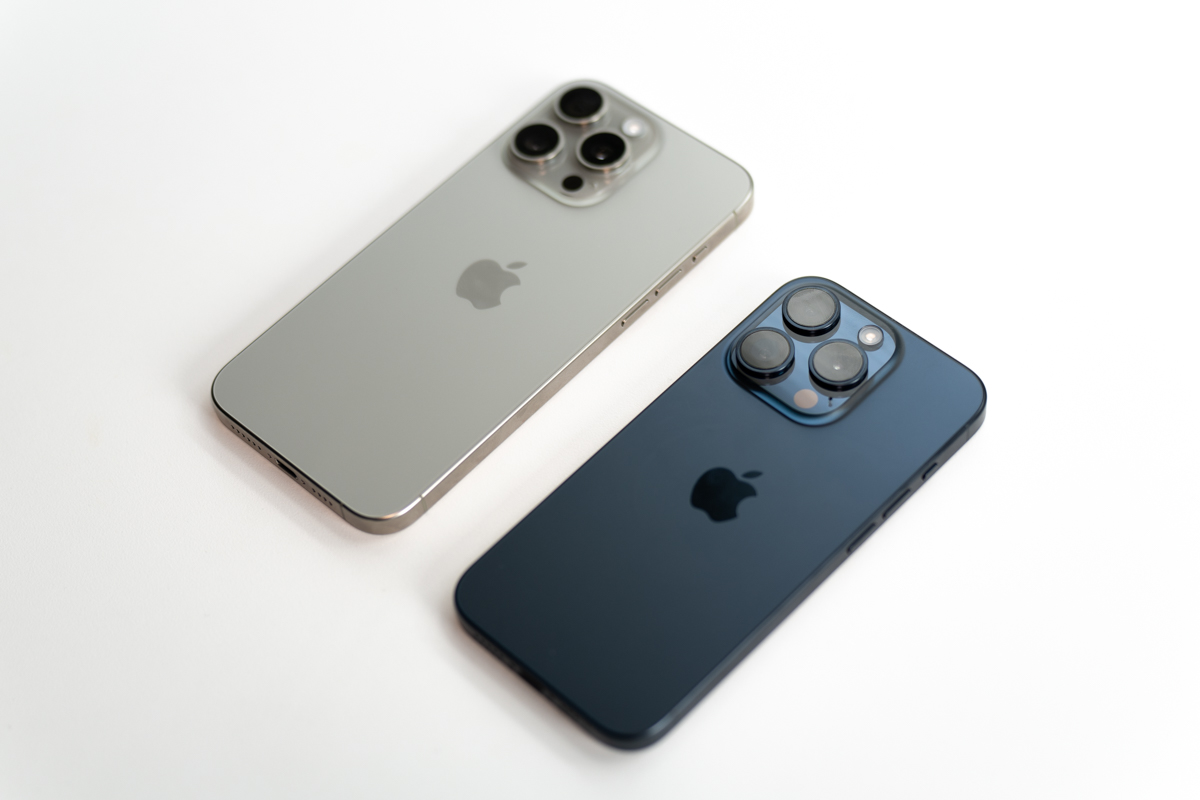
Image Credits: Darrell Etherington
A new phone also means a new chip. Last week’s iPhone event was also the debut of A17 Pro, which the company calls the “fastest chip ever on any smartphone. It’s first-party silicon that is currently only available in the two pro models. The rest of the line inherits the A16 Bionic, which was introduced with last year’s 14 Pro and 14 Pro Max. It’s a point of differentiation between the standard and pro models, while still being able to tout chip upgrades for the entire line. Per usual, the chip was designed by Apple and is currently being manufactured by TSMC in Taiwan using a three-nanometer process (down from the A16’s 4-nm).
Like its predecessor, the system has six CPU cores, themselves broken up into two categories. There are two “high-performance” cores and four “efficiency cores.” Effectively the latter do the heavy lifting when performing research-intensive tasks that require a lot of compute power. The latter two, meanwhile, handle simpler tasks and save computer — and battery — in the process. The company claims the new high-performance cores are 10% faster than last year’s model.
The real trick here, however, is on the graphical side of things. Here the core number has increased from five to six. During last week’s event, Apple referred to it as “our biggest redesign in the history of Apple GPUs,” stating that graphical performance is up 20% from last year’s models. Bold claims, to be sure, but also in line with what the company has been pushing on the gaming side of things. After all, the company also recently referred to the iPhone Pro models as “the best game console.”
It’s an odd quote at first glance, full of customary Apple bravado. As Nintendo taught us years ago, graphical prowess isn’t the end all, be all of what makes a console. Content is a huge part of the equation. There’s no question that the iPhone has established itself as a powerhouse to be reckoned with in terms of casual gaming. Apple Arcade was the icing on that particular cake. AAA titles is a different conversation altogether.
That’s been an extended and hard-fought battle for the company. A long time ago, Apple had a lead on the gaming side, only to be eclipsed by Windows in the 90s. The company largely took its eye off what has become a $142 billion industry and has spent more recent decades clawing back some market share. Certainly, the Mac has grown increasingly capable, courtesy of the M line of chips, but the iPhone has long been the tip of the spear.
The handset is now capable of playing titles like the Resident Evil Village — something that would have been unthinkable a few short years ago. In fact, the title recommended for testing the graphical prowess of the new M2 chip — even that would have been highly unlikely from the previous generation. It’s wild to watch Apple’s phones and laptops progress at similar speeds, but it makes a lot of sense, given how much DNA is shared across the silicon.
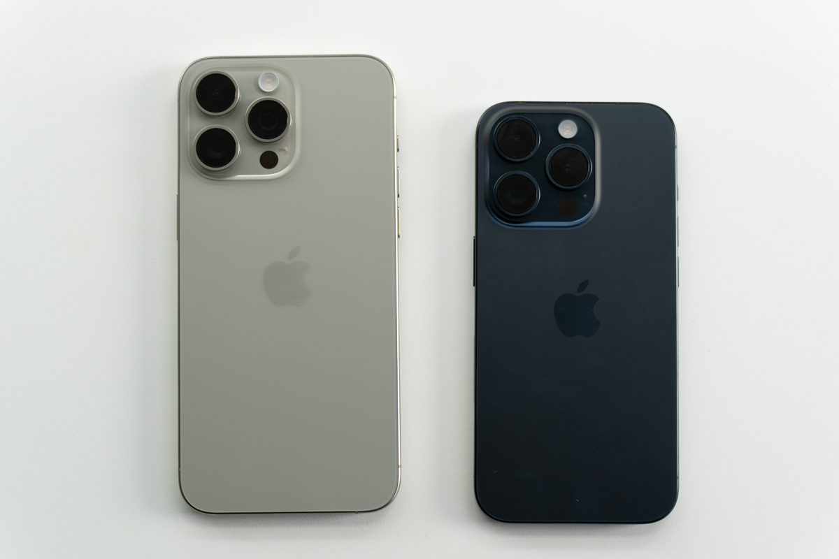
Image Credits: Darrell Etherington
If you remove casual mobile games from the equation, however, it’s difficult to make the argument that iOS rivals other pure consoles. At the moment, AAA games are arriving with more trickle than deluge. But the games are coming, including the Resident Evil 4 remaster, Death Stranding and Assassin’s Creed Mirage. Apple has lowered the barrier of entry for porting titles to the platform, and it’s relatively easy to bring them over to iOS and Mac in one fell swoop.
Indeed, Resident Evil Village plays well on the iPhone — an accomplishment in and of itself. The phone can get a bit hot to the touch, but honestly, my biggest gripe is about interface. Migrating to any platform presents its share of challenges. In the case of moving from a console/PC to a handset, the problem is two-fold: 1. Controls 2. Screen size. These things are connected, mind you, as — even at 6.7 inches — everything is vying for the same limited screen real estate, including controls.
For Resident Evil Village, the solution is a combination of using the touchscreen to let the view look around and overlaying controls directly onto the display. It starts to get real crowded, real quick. This, mind you, is a ringing endorsement of products like Backbone, which adds a pair of physical controllers into the mix, freeing up a lot precious screen real estate in the process.
The third leg of this SoC stool is the 16-core neural engine. This is the bit that processes the machine learning that is becoming increasingly integral to just about every feature on the devices. That goes triple for the camera. A few years back, there was ongoing discourse around whether phone cameras of the future would be powered by hardware or computational photography. Google was very much on the computational side of the spectrum, while Apple’s approach more readily embraced the physical camera system.
All parties appear to have learned the same lesson here, that the answer lies somewhere between these two poles. Computation photography is — and will increasingly be — an essential aspect of mobile photography. But it can’t do all of the heavy lifting on its own. You still need powerful lenses and sensors to capture the images in the first place. Imaging continues to be the primary battlefield on which the smartphone wars are fought. Ultimately, consumers continue to be the winners.
I won’t go so far as to say that it’s hard to take a bad photo on these devices — you can take a bad photo on the world’s most expensive and advanced hardware, if you really put your mind to it — but I will say that it’s hard to find a bad camera on a flagship device in 2023. There are pros and cons to each of these systems, but all excel in their own way. Computational photography has become an increasingly essential piece of Apple’s strategy on the camera side.
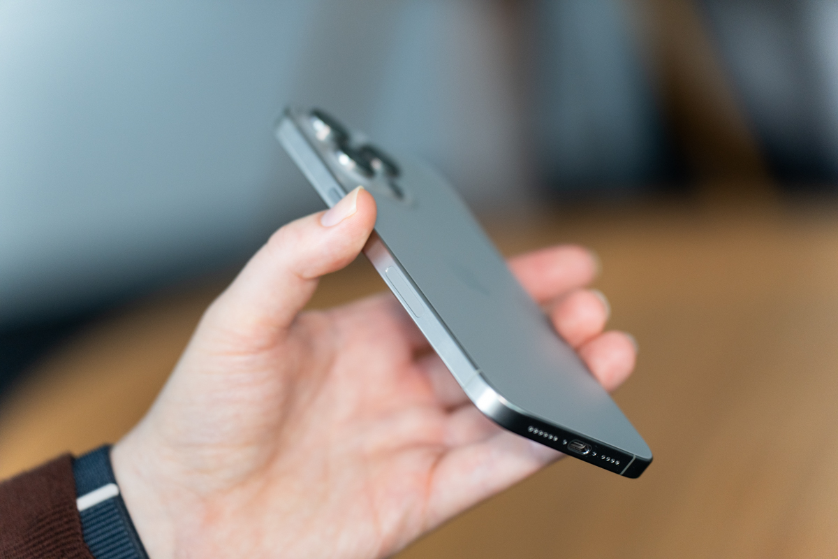
Image Credits: Darrell Etherington
Before I go any further, I recommend checking out Matthew’s Disneyland review for a deeper dive on the imaging side of things. I’ve been mobility challenged for the past few weeks, so my photography hasn’t been up to the standard I generally like to hit with these sorts of reviews.
The iPhone 15 Pro Max has three cameras: 48-megapixel wide, 12-megapixel ultra wide and 12-megapixel telephoto, with a 5x optical zoom. It’s essentially the same system found on the iPhone 14 Pro Max, with the telephoto bumped up from 3x. One thing worth clarifying (I admit that I need a little clarification myself) is the distinction between “optical quality,” which Apple used to describe zoom on the iPhone 15 and “optical,” which was used with the Pro models. Since the lenses are fixed (i.e. they don’t physically move to zoom), you get pure shots at 0.5x, 1x, 2x and 5x (the fixed zoom on the telephoto).
That’s why those are the four zoom options that are presented by default inside the camera app. To get the highest quality photos, you’ll want to stay on those numbers. The quality won’t be as good in between the numbers, but you almost certainly won’t notice. Beyond 5x, however, things begin to degrade and noise is introduced, just as it is with all phone camera systems.
Coming from the iPhone 14 Pro, one thing that really impressed me is the quality of random snaps — those photos you fire off because you see something interesting on the street or need to take a quick shot of a receipt for expenses. The system strikes a great balance, even in those moments where there’s uneven light or backlighting. The HDR performs remarkably well on this system.
It’s impressive how far the bokeh effect has come on these devices. Early generations struggled a lot around the edges, particularly with things like hair. The new images are far more seamless, particularly when engaging Portrait Mode to utilize depth mapping on the system. The phone can also automatically trigger the functionality when faces, cats or dogs are detected (sorry fellow rabbit-havers). This mode gives you that Lytro-style effect, where you can seamlessly tap between different depth layers and have it respond in real time. If it has captured a person, you can also turn portrait mode on or off after the photo is taken. It’s an impressive level of flexibility.
Taking some meetings with Continuity Camera, I was also impressed by how well it adapted to different depths while filming. One person asked whether I was using an SLR from my hotel room, which is a massive vote of confidence. It’s a nice bonus, particularly given the fact that — while they’ve gotten better — Mac webcams still have a long way to go. The images stabilization is quite good, as well. If cameras are your main concern, the iPhone Pro Max can pull of some truly impressive shots.
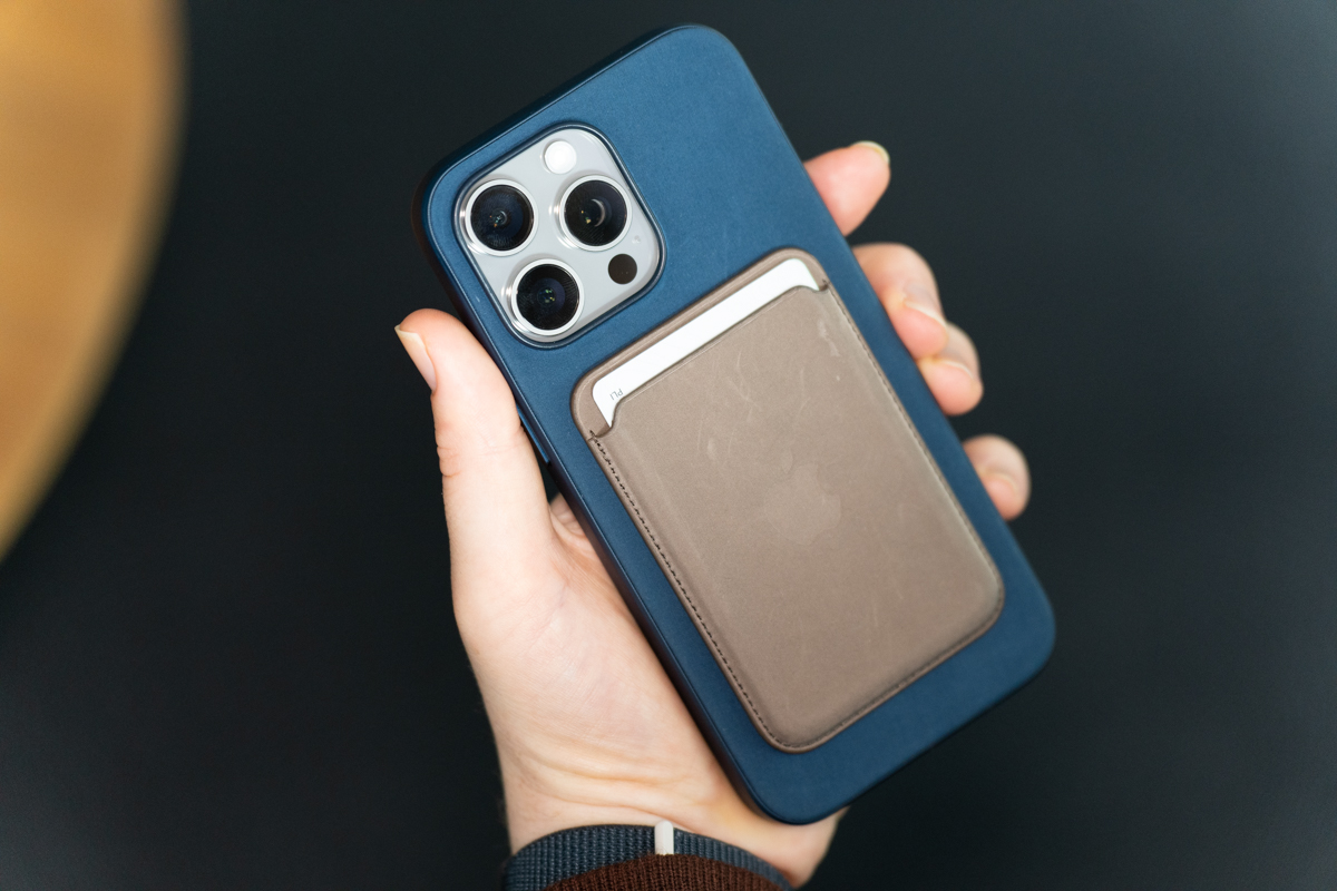
Image Credits: Darrell Etherington
Rounding out the features are a slew of wireless technologies. The iPhone 15 models are the first handsets to ship with the new Qi2 (though the devices aren’t yet officially certified). The latest version of the wireless charging standard is in line with what Apple has offered with MagSafe for several years now. The system combines wireless charging and magnets to keep accessories in place and minimize power loss. The MagSafe connector is capable of charging the system at 15 watts.
Meanwhile, the second generation Ultra Wideband chip offers far more precise Find My functionality when your objects (or people) are close by. The Apple Watch Series 9 got an UWB upgrade, as well, though. That means you can use an iPhone to find another iPhone or a Watch to find an iPhone, but not an iPhone to find a Watch — at least not yet.
Roadside Assistance is a great addition — but one of those I wasn’t able to test at press time. The feature is an add-on to the phone’s satellite offerings that makes it possible for drivers to get help without a cell connection. The feature is currently only supported in the U.S., through a partnership with AAA.
Funny to say that a new port is the star of the show with a phone that starts at $1,200, but here we are. The addition doesn’t detract from some great new features, but it may well be the thing that truly drives iPhone sales over the next few quarters. Much like 5G, I suspect many consumers were patiently waiting for it to arrive before pulling the trigger on a pricey purchase.
The implementation of titanium is really great. It looks nice and makes for a noticeably lighter phone. Meanwhile, the camera system continues to impress. The iPhone 15 Pro Max isn’t a major departure from its predecessor, but it’s proof that 17 years after the first iPhone, the handset still has some new tricks up its sleeve.

