Apple Watch Series 9 review
It’s hard to know the right time to upgrade. It’s a question I get a lot, having done this job for as long as I have. It’s the double-edged sword of FOMO: wanting to get your hands on the latest thing as soon as possible, while worrying that next year’s model will just be that much better. The good news is that — more often than not — updates are incremental. Products generally don’t swing radically from one year to the next — that’s not how things work at this scale.
I bring this up right out of the gate because we are presently one year out from the Apple Watch Series 10 (X?). Rumors around the device began swirling well before the Series 9 was made official this time last week. The iPhone X could prove precedence for update, as Apple marked the decade milestone with a radical shift.
The Apple Watch Series 9 is a lot of things, but radical isn’t one. There are plenty of reasons for this, but the primary one is the simple fact that the Apple Watch has been a historically winning formula. Few consumer electronics dominate their category quite like it. According to Counterpoint research, the line accounted for more than 34% of smartwatch shipments last year. The product’s revenue percentage is even higher, at 60%.
Looking at numbers like that, there’s little justification for radical transformation. The Apple Watch has become an inseparable part of millions of wrist (charging time aside). I’ve heard multiple stories from friends who had doctors recommend the device to monitor ongoing health problems like AFib. You can’t buy that kind of PR. Of course, nothing lasts forever, least of all market dominance. Cheap devices, often produced by Chinese manufacturers, have eaten away at some of the low end. At the high end, the Wear OS/Samsung alliance is determined to convince the world that there’s more than one game in town.
For the foreseeable future, however Apple is in no danger of falling off its perch, so it’s done what any reasonable company would do in its place: build and refine. An ideal foundation is in place: a capable and well-liked device with an increasing focus on health-related functionality. All told, the Series 9 isn’t a huge update, but it heralds the arrival of a couple of key new features that build atop of what is already one of the most mature smartwatch experiences on the market.
Double Tap is — far and away — the most interesting addition to the device, this time out. Like many innovations in the smartwatch space, the feature is focused on the question of how to do more with less. A 1.7-inch screen is extremely limiting. Beyond that is the fact that — unlike most pieces of consumer electronics — the device is tied to a single body part. While the form factor is designed to free you up, you can wind up doing a lot of juggling when carrying items, hanging on the subway strap, opening doors, etc.
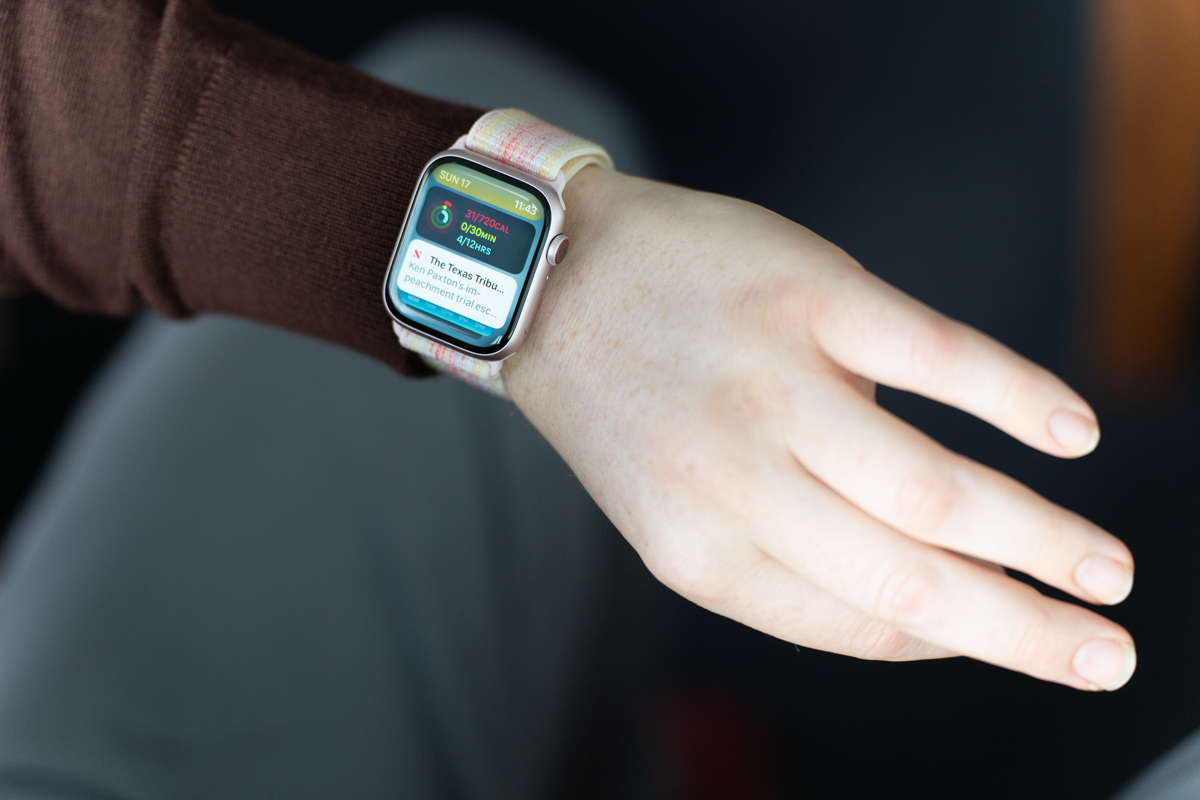
Image Credits: Darrell Etherington
Double Tap is a new input method that leverages a bevy of existing sensors in interesting ways. Lift the arm up and turn the watch to your face, much the same way you would if you were checking the time. Now tap your index finger (or any finger, for that matter) and thumb together twice in rapid success. This simple gesture can perform an array of different tasks, which the Watch will prioritize, based on context clues.
Say you’re getting a call. One Double Tap will answer, and another will hang up. There will be a nice range of applications out of the gate, including scrolling through your notification Smart Stack, stopping and resuming timers/stopwatches, snoozing alarms, playing and pausing music and turning the flashlight on and off. There is no API available for the feature, however. Third-party use will be limited to interactions with notifications.
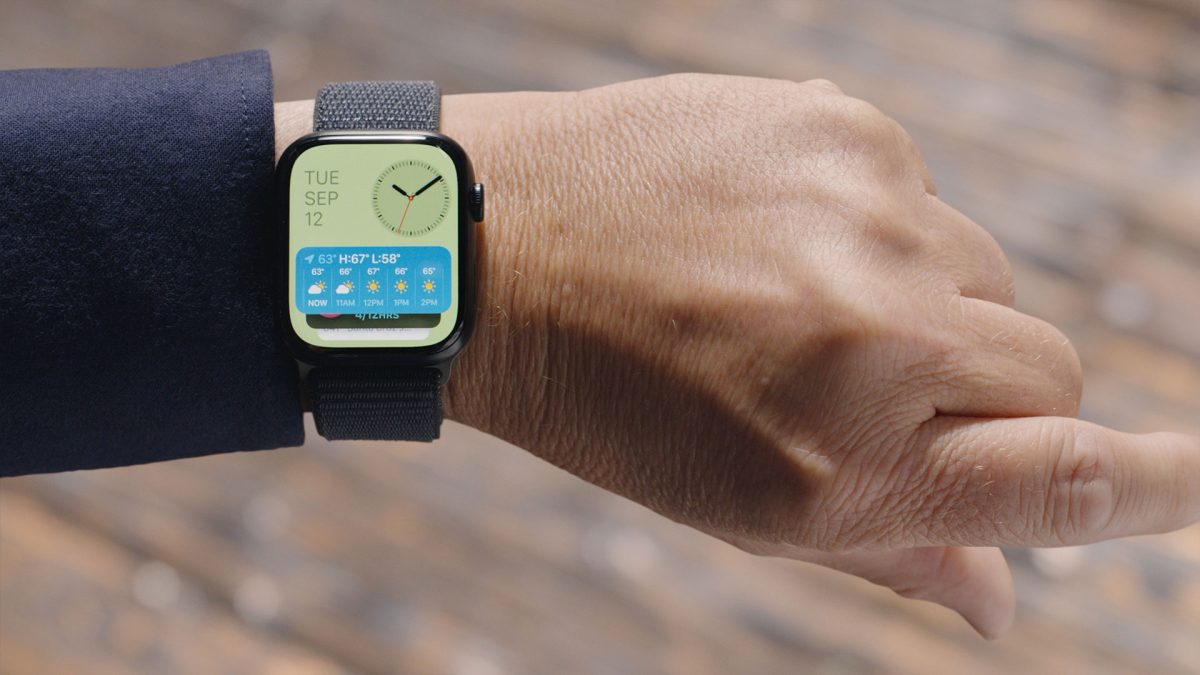
Image Credits: Apple
Douple Tap is one of those features that is as interesting for how it works as for what it actually does. The system leverages existing sensors, including the gyroscope, accelerometer and heart sensor. Detecting such a subtle movement without triggering false positives is a difficult balancing act. That’s likely why it’s deliberately a two-part gesture. Simply double tapping your digits together with your arms at your side won’t accidentally prompt it.
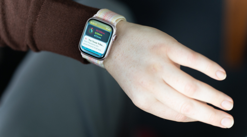
The most fascinating bit here is the use of the optical heart sensors, which detects subtle changes that occur when performing that specific action. In preparation for this piece, Apple sent along a demo unit explicitly for the purpose of testing the feature. That’s the unit with the weirdly colored Nike band that you see in these photos. The device arrived loaded with a beta version of double tap, and was therefore not meant to be used for any other element of testing, due to its unfinished software. The final version of the feature won’t arrive until next month.
The feature works as advertised. Lift your arm, double tap and a small hand icon shows up at the top of the screen, acknowledging that you’ve executed the task successfully. As is the case with any of these new input paradigms, it takes a bit of brain rewiring before you feel confident integrating it into your daily life. Ultimately, it’s a clever and fun way to circumvent some of the device’s hardware constraints, adding to touchscreen, voice and the digital crown. It’s most useful for quick, one-off tasks, when you’re juggling too many things with your other hands.
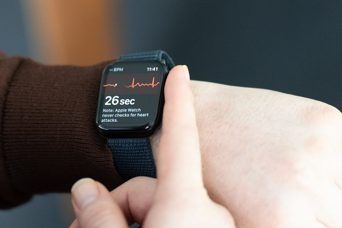
Image Credits: Darrell Etherington
It’s also interesting for what it may signal, going forward. Leveraging on-board sensors to detect body movements presents a lot of potential for both the Apple and Watch and other devices, moving forward. One can certainly see a future in which additional biometrics play a role in how users interact with, say, the Vision Pro.
One other bit is worth noting on the Double Tap front. The feature is actually an evolution of Assistive Touch’s hand gestures, which are available for Series 4 and later for people with limited or no functionality in their opposite arm. Gestures include clench (your fist), double clench, pinch and double pinch, the last of which is basically double tap. That feature can be used to trigger Siri, display apps and fire up Apple Pay, among several other possibilities.
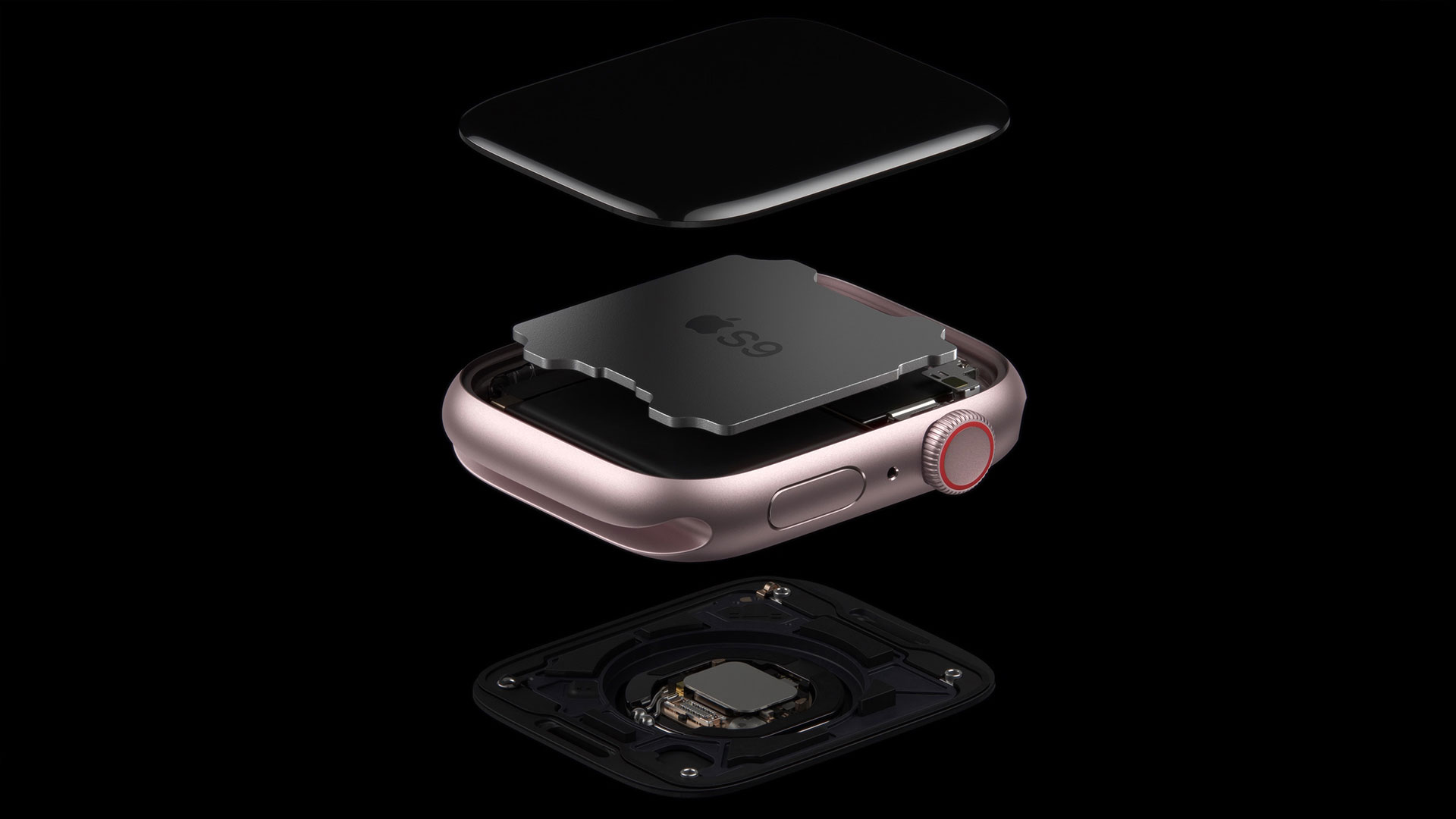
Image Credits: Apple
Double Tap is designed to be the sort of feature one doesn’t think about — a bit of a polar opposite from Assistive Touch, which requires a fair bit of customization on the user’s part. Also, once it’s up and running, it effectively changes the UI with various prompts reminding the wearer about different interactive functions. As for why Double Tap is only available on the newer Watches, that appears to come down to hardware limitations.
Double Tap is enabled, in part, by the new S9 chip that can also be found on the Apple Watch Ultra 2. The company calls it , “our most powerful chip in Apple Watch ever,” which I have no reason to doubt. It has a dual-core CPU, and a quad-core Neural Engine, which Apple claims can execute machine learning tasks at double the speed. ML will, of course, only grow in importance as the line evolves. Much of what makes a device like this function well is its ability to anticipate what you need from it. The fewer times you have to tap the screen, the better.
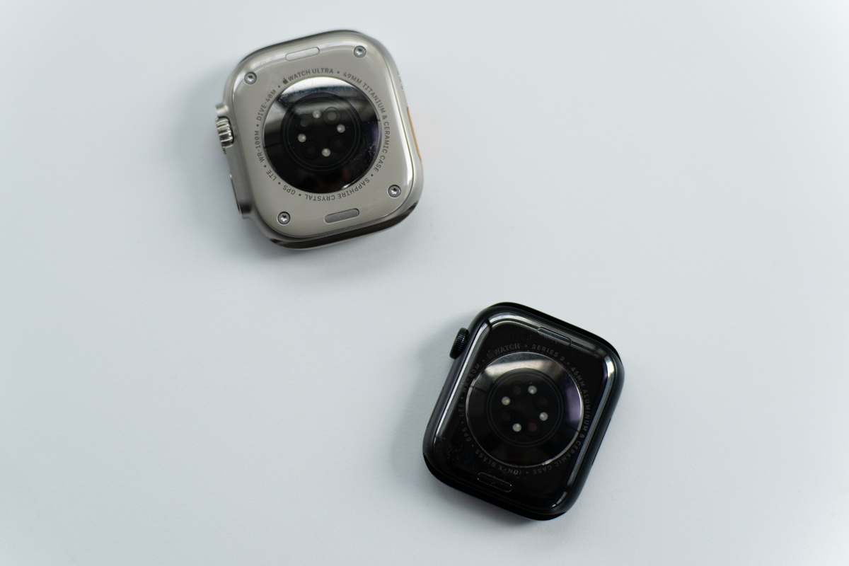
Image Credits: Darrell Etherington
Performance isn’t just about speed, however. Efficiency is also key, especially when discussing devices with limited battery life. This, of course, has been a longstanding bugbear among smartwatches in general. Every year we hope for some radical battery life upgrade, but the changes have largely arrived in the form of features like battery saver mode and an alert to let you know if you need to charge before bed.
As it stands, I’ve been getting through a full day’s use on a charge, with enough juice to get through the night. Obviously, there’s a good deal of fluctuation there, depending on which features you use and how active you are. I’ve been bumbling around Northern California with a herniated disc the last several weeks, so unfortunately my activities have largely been limited to a slow motion zombie limp.
There’s a lot happening in and around smartwatch batteries. While I suspect most Apple Watch owners are mostly fine with the current battery life, multiday use seems like the next obvious frontier for the lines, especially as Apple continues to put increasing focus on sleep tracking.
There’s a big focus on cycling workouts this time out. For the extremely painful reasons listed above, I wasn’t able to take them for a spin, this time out, so I’ll just list them off for now, instead. At the top of the list is the ability to connect directly to accessories via Bluetooth. The experience also offers the ability to stream cycling workouts to the iPhone, so you don’t have to keep looking down at your wrist during the ride.
Image Credits: Darrell Etherington
The Mindfulness app gets a few new tricks, including mental health tracking. That essentially boils down to a series of questions to help you pinpoint your mental health level, which you navigate using the crown. The app can also be set up to send reminders to log that info each day. I’m curious to see how this will play with the upcoming Journal app for iOS 17 — it makes sense to connect the two. Presently Apple mental health features are fairly limited. It will be interesting to see whether the company branches into more aspects like guided meditation.
A number of first-party apps have gotten a redesign in watchOS 10, including an overhaul to the Fitness app. It’s cleaner overall, but it will take a bit of relearning workflows on the user’s part.
The new watch also leverages the on-board ambient light sensor to determine the number of hours you spend in daylight. Other sensors, including GPS, also factor in, so the system can better distinguish overhead lighting from the outdoors. There are plenty of good reasons to get some sunlight each day, but Apple says myopia in younger people was the primary driver. You could, perhaps, consider this Apple’s TouchGrass feature.
That data can then be viewed on a connected iOS device (though not the watch itself). “Too much of a good thing” can certainly apply here, of course. It would make sense for Apple to add an alert so those of us easily prone to burns can seek some sheltering shade, though actual sun exposure can be more difficult to quantify with just a light sensor.
Like the iPhone 15, Apple’s new Watches have received an upgraded Ultrawideband chip. That brings enhanced Find My capabilities here, though usage is a bit more limited than on the handset. Specifically, you can use the iPhone 15 to find other iPhones. You can now use the Watch to find them, as well. But neither the new phone or Watch are capable of finding other phones through this method, owing to the limitations of antenna size. Another motivating factor behind the design is that Apple seems to believe that people are less likely to misplace their Watch versus phone, to which I say, you would be amazed at the things I’m able to lose and the places I can lose them.
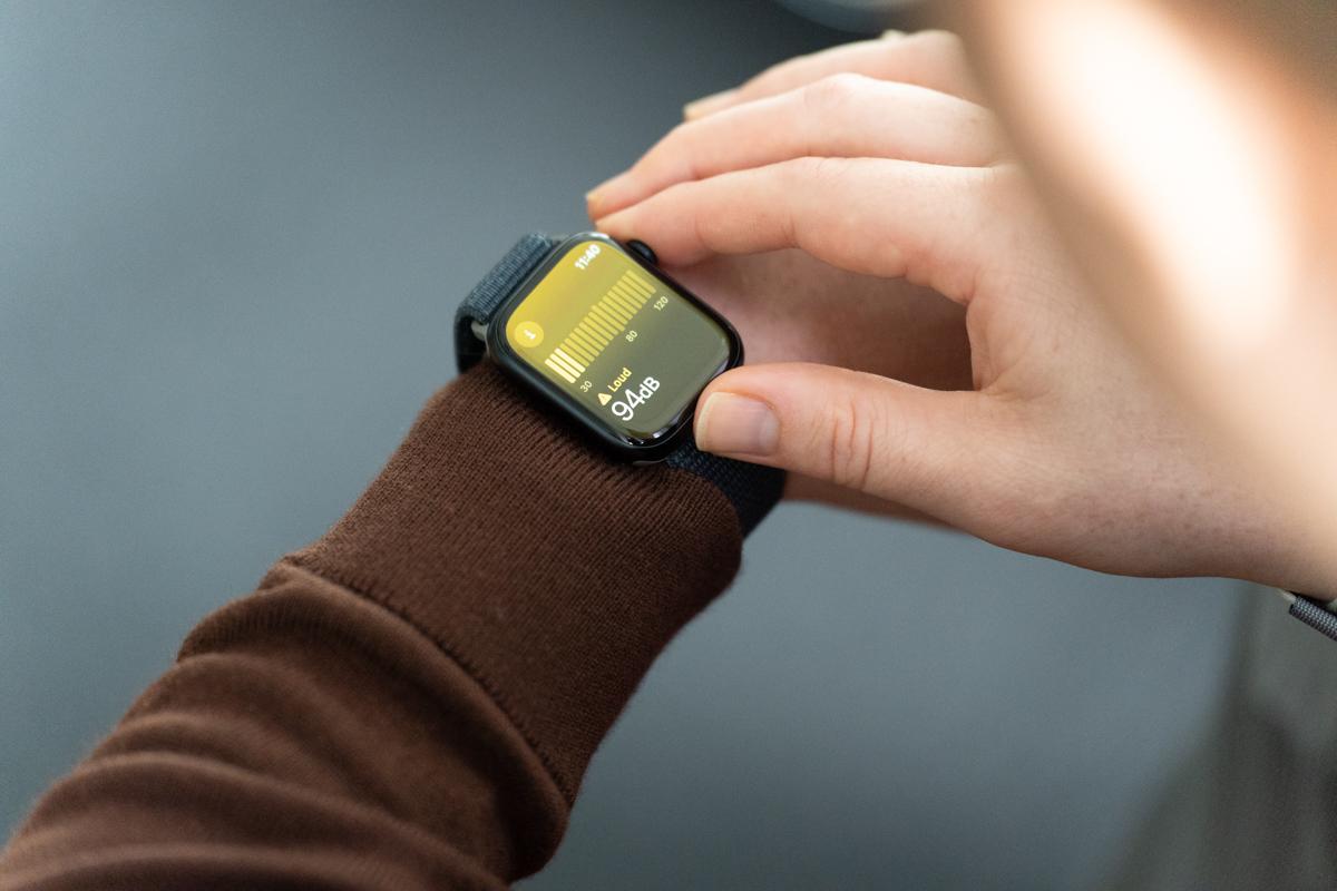
Image Credits: Darrell Etherington
The Watch’s design remains largely unchanged from the Series 8. The biggest change on that front is the notable fact that Apple is touting the wearable as its first carbon neutral device, owing to a number of different factories, including recycled materials, slimmed down packaging and carbon offsets. According to the firm, its claims are vetted by SCS Global.
In the end, it’s hard to shake the feeling that this is one of those in-between years. Certainly, the pressure and rumors surrounding next year’s Series X have contributed to that notion. Double Tap is certainly an interesting, standout feature, though probably not enough to warrant an upgrade over a recent model for most. If you’re at the end of your upgrade cycle and don’t want to wait for what may or may not arrive a year from now, however, Apple remains an industry leader in the smartwatch space.

