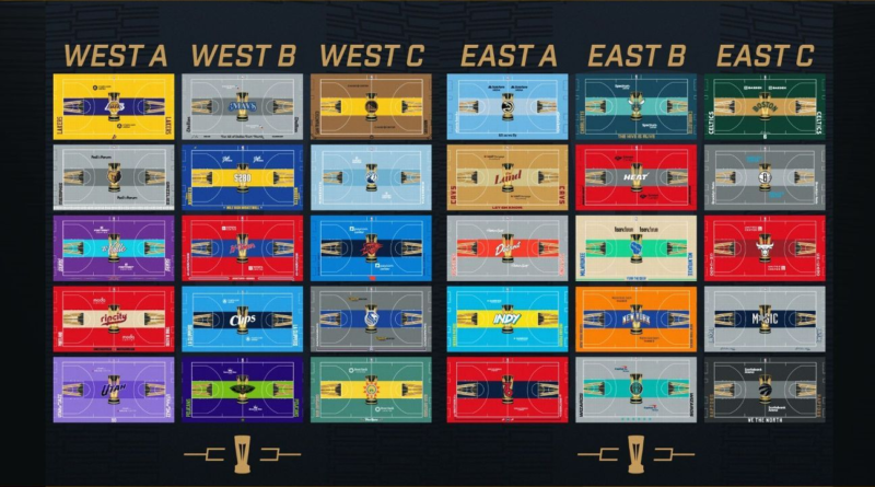
How the bold new NBA in-season tournament courts came to fruition
About seven months ago — when the NBA was optimistic its long-dreamed-of in-season tournament would finally become reality — the league’s creative brain trust began tinkering with a big question: How could they make sure fans would know instantly they were watching a group stage game?
Sure, the league could work with broadcast partners so that scoreboards would alert viewers that the game was part of the tournament. That was easy. But those words and markings are small and might fade from the viewer’s consciousness fast.
Around April, they started thinking about the basketball court itself. Officials proposed special decals on the floor and boundaries, similar to the ones it uses for the NBA Finals and All-Star Game — only these might read “Group A” or “Group B,” perhaps alongside a rendering of the trophy the tournament winners would eventually get. Others suggested the teams might warm up in new shooting shirts used only for tournament games.
Around mid-July, they took those ideas to senior leadership, including commissioner Adam Silver. The feedback — with Silver perhaps the loudest voice — was clear, said Christopher Arena, the NBA’s head of on-court and brand partnerships: “More, more, more — bigger and bolder.”
Soon after, a combination of Silver, other senior leaders and the league’s creative services group started kicking around a bigger idea: What if we painted the entire court? And what if we did it for all 30 teams, using the same general template?
“The biggest decision was to paint the entire court with no wood showing,” Arena told ESPN. “That was the ‘Wow.'”
By late July, they had settled on that template: The bulk of the court in one color linked to each team’s City Edition uniform, with one central strip the width of the in-the-key painted area running from baseline to baseline in another shade — meant to evoke an airport runway, and the idea that each group play game had the teams on their own runway to the tournament’s final four in Las Vegas.
A giant in-season tournament trophy would serve as the center-court logo, superimposed on each team’s individual logo. A tipped-over version of the trophy would be squeezed inside the foul line on both ends of each court.
“We started making decisions later than we probably could have,” Arena said. “And it became, ‘OK, how are we going to do this? How are we going to get 30 courts to 30 teams in 29 buildings, and do it in time? Are we crazy?'” (The Los Angeles Lakers and LA Clippers play in the same arena.)
Here are three finished examples — one update on a classic court (the Lakers), and two more radical floors based upon city edition jerseys from the Phoenix Suns and New Orleans Pelicans:
(Yes, the Pelicans are embracing a combination nightlife/Halloween theme in their City Edition art this season, complete with a revamped bony pelican logo — nicknamed the “skelican” in some corners.)
On Aug. 10, the league requested the main facilities contact for each of its 30 teams attend a Zoom call. The plan was to show them some renderings, explain the turnaround required and request their cooperation. They braced for objections. Several teams with iconic courts — the Boston Celtics, Lakers and the Chicago Bulls among them — had never used an alternate court.
It would be a heavy lift for everyone: team employees; league staff who had to locate 29 available courts and arrange to rent some of them; the painting and refinishing companies who would have to accelerate some jobs to fulfill the league’s request; even trucking companies who would transport the courts to those refinishing facilities.
Some arenas need courts of slightly different total widths and lengths depending on several variables, including court-side seating.
“It was sort of like playing Tetris,” Arena said. “But everybody was like, ‘I get it. I understand why we are doing it.’ I get tingly now thinking about it. It has been a remarkable collaboration to finish these in time.”
The league stressed that the template was essentially non-negotiable, but gave teams input into the color choices. That process took another week or two. Meanwhile, the league found courts and readied its refinishing and painting partners. Some are used college courts. Two teams — the Indiana Pacers and Suns — repainted the floors used by the WNBA teams in their respective cities. All 29 are sourced from the only three companies that manufacture NBA courts: Horner Sports Flooring, Robbins Sports Surfaces and Connor Sports.
At the Praters Flooring facility in Rossville, Georgia, crews sped up pre-existing finishing and painting jobs to clear as many of its 10-floor slots as possible for the NBA’s incoming mega-project. Praters ended up painting and refinishing 11 of the 29 in-season courts, and with those 10 slots, could handle several courts at once. (A total of 10 companies participated in the refinishing, sanding and painting of the 29 courts, league officials said.)
“We were very nervous three weeks ago, because it was going to be very challenging,” said John Prater, the founder and CEO of Praters. “Nothing ever goes totally according to plan. For our employees, it was, ‘Hey, it’s 4 p.m. on Friday and I bet you want to go home, but nobody can go home right now.'”
Prater had a crew of 25 to 30 people working at least six days per week on the 11 courts. A repainting can take two weeks, Prater said. The company compressed that to about a week per court. Each court requires about 50 gallons of paint, Prater said. The company acquires paints from a supplier — Bona — and then mixes them to match each specific PMS (Pantone Matching System) shade as specified by the league and teams.
“It basically became a paint party,” Prater said.
Two courts are still unfinished, but all 29 are on track for their unveilings.
Some other courts that will make waves:
That is striking, and a lot of red — red on red, in fact, with a white Bulls logo.
Whoa! The Pacers are getting a little frisky with some artsy, graffiti-esque lettering and a much brighter and bolder blue to go with the yellow runway.
Here are a couple of pleasing blue-on-blue courts — the Wolves a more placid light blue, and the Thunder going with a high-contrast between dark and light shades. The orange center-court logo and little Oklahoma state map on the near sideline really pop against the blues. The Thunder — once maybe the league’s most blah art team — have been on a roll for about a half-decade now.
The Blazers — the league’s best art team to these eyes — nail it again with a red-and-wood combination, and the “rip city” word mark rendered in Dr. Jack Ramsay-inspired plaid.
The Bucks’ court is another window into the degree of experimentation the league and some teams are daring with these floors. Their cream shade — usually part of the trimming — takes center stage, sandwiching a runway rendered in a lighter green than the Bucks normally use. There are no deer here, with the Bucks opting for their blue Wisconsin-shaped logo atop the center-court trophy.
The Celtics — owners of perhaps the most iconic basketball floor in the world — played it fairly traditionally, going with dark green in the bulk of the court and a wood-shaded runway:
The league went back and forth with at least two teams on colors, according to Arena and other league officials. In debating several proposals, the New York Knicks asked the league if they could use a gray-ish shade instead of orange for the majority of the court, but the league stressed the importance of sticking with the team’s core colors — in this case, an orange court, Arena and other league officials said:
For the Sacramento Kings, the league initially suggested a majority red court to echo elements of the team’s city edition look this season. The team pushed back, pointing out that red was a minor part of its overall palette; the result ended up here:
Adding the tilted-over trophies into the paint required some consultation with Monty McCutchen, the league’s senior vice president of referee development and training, to make sure referees would still be able to make out the block-charge circle amid the jumble, Arena said. The boundary lines are also at their maximum width — four inches — which is the NBA’s standard for courts on which the playing floor and the apron around it are the same color, Arena said. (Other courts can have two-inch-wide boundary lines.)
The league and the third parties who helped are excited about the results. They know the new courts are bold — a striking departure.
“It’s like art,” Prater said. “Some people like it, some people don’t. You can’t please everyone.”
The league is confident most fans will like the floors and that the courts will serve their main purpose.
“We just had to separate these games from all other games,” Arena said. “You have to turn the channel and know right away, this is different.”


