Boox’s latest e-readers combine quiet, compact styles with big customization
Boox has a confusingly wide array of devices to choose from, but the latest make a good case for themselves as powerful, compact alternatives to Kindle and Kobo. The delightfully small Poke 5, even smaller Palma, mid-range Page and larger, color Tab Mini C are all worth your consideration if you’re looking to upgrade.
Boox, a sub-brand of the Chinese company Onyx, makes dozens of readers and it can be hard to keep up. But I like to check in now and then and see what they have on offer, especially since they like to experiment a bit now and then.
Speaking generally, I would say that the main strengths of these devices are their build quality and customizability. Their weak points are their crowded interfaces and limited app selection. But if you’re comfortable bringing your own books and tweaking settings, it’s nice to have a wide range of sizes and styles to choose from.
Not that these Boox devices are particularly loud in the design department: no, they’re quite featureless, something I appreciate. Device makers can get cute when what they’re making will be used lightly and occasionally for a minute or two, or for a purpose that rewards creativity. Look at the Playdate!
But e-readers, in my opinion, should disappear. The only thing I want to see is words on a page, and if I feel like it, a page number or some other metadata. Although I appreciate a bit of flair now and then, like the clever and bright folding Kobo stand-cases, I abhor unusual shapes or button placements on a device that may well be held and looked at for hours.
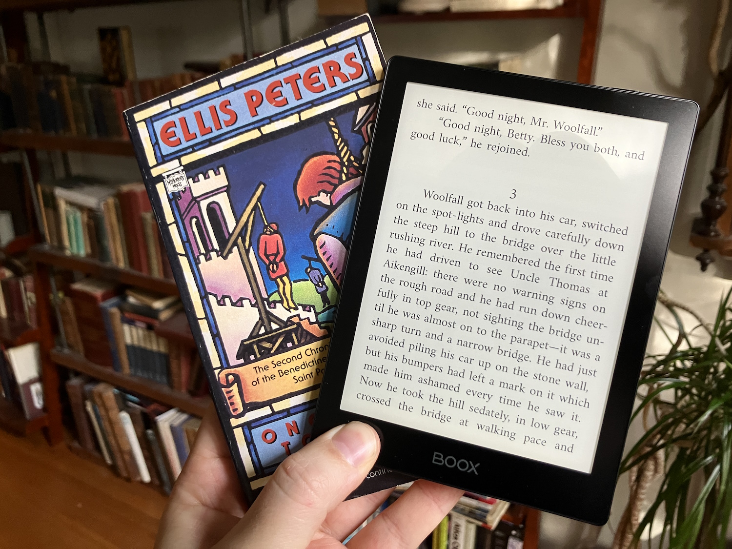
That’s why I’m so pleased with the Poke 5, which is slightly smaller than the previous pint-size champion, the Poke 3 — but not thinner.
Size: Small
The Poke 5 ($170) is about as close to a Platonic e-reader ideal as I’ve found: flush screen, just-big-enough bezels, a quiet logo at the bottom and only one button — power. Though a small reader at six inches, it does not have a second-rate screen. It’s a 300 PPI display (1072×1448) with color-adjustable frontlight. The build is solid and no-nonsense, and even if it makes no nods to being “premium,” there are no unsightly cracks or loose bits.
No page-turn buttons (which some prefer) and less screen real estate are to me easily outweighed by the portability of this thing. It fits in nearly any pocket, including the front pocket of my jeans (though it does look a little odd), and takes up almost no room in any bag. Since I like to take my readers everywhere, this is a huge advantage over even other small-ish readers.

Image Credits: Devin Coldewey / TechCrunch
There’s a low-profile case with magnetic attachment and closure that automatically turns the device on and off — it’s a quality item, but I’m spoiled by Kobo’s folding stand cases.
Boox devices are easy to load books and custom fonts on, and once you’ve turned off a lot of the cruft (a default-on navigation ball, lots of status stuff on the reading screen, etc.) it is a very straightforward, elegant reading experience. The text is crisp and spaced well, I encountered few typographic or layout errors, and it’s very responsive to page turns and menu taps. You can also tell it to enter high-speed mode in case you’re reading a document you’d prefer to scroll through, or a web page.
The apps officially available in the U.S. are, sadly, pretty limited. There’s no Overdrive support, no American book stores, only a few Google apps for productivity (Gmail, Keep, Translate). So this is very much a BYO books situation unless you want to get fancy and load a new launcher. You must create an Onyx account if you want to sync reading status, push articles to the device, etc. (this is true of all of these devices).
Fortunately you are also free to sideload apps and marketplaces via the browser, if you so desire. As I didn’t want to trouble my review unit with this process, I didn’t attempt it, but forums and tutorials abound if you want to give it a shot. Combined with the microSD slot and basic Android capabilities — Bluetooth, music player, etc., these minimize the need to operate two devices at once if, say, you want to listen to Schubert while reading.
Size: Extra small
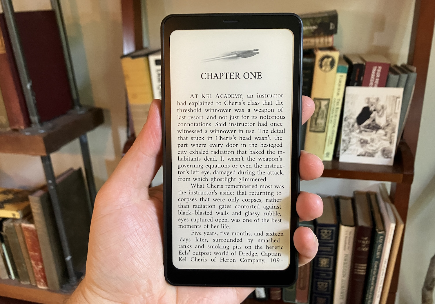
I once thought that e-readers couldn’t get too small, but I’ve finally hit my limit with the Palma ($280), a phone-size reader that takes things just slightly too far in that direction.

Image Credits: Devin Coldewey / TechCrunch
The Palma has a six-inch screen and 300 DPI like the rest, though it looks and feels (and is) smaller due to its phone-like aspect ratio. It runs a modified version of Android with minimal apps installed but has the ability to download more in a less roundabout way. The reading app, however, is the same, and it supports just as many formats, fonts and customizations.
You’ll need them, because it can be tough to find the right settings on this narrow screen! Now, for some, this might not be as much of a stretch, because they are used to reading books on their phones already. For those folks, this could be a breakthrough. The dimmable, color-adjustable front-lit screen is every bit as good as the best readers on the market, just a different shape. The “volume” button on the right side can even be set to page turns, which makes one-handed reading very easy.
There’s also 128 GB of storage built in and a microSD slot, so if you wanted to load up audiobooks or even a couple hundred albums, you’re more than welcome (though the default music app is very minimal). The mono speaker isn’t great and there’s no headphone jack, so stick to Bluetooth.
For me, it’s a little distracting to have this aspect ratio instead of the more paperback-esque dimensions of the others. It’s hard for me to imagine I’m reading a book when there are only eight words per line at maximum. The resolution of the screen does make smaller font settings work perfectly well on the Palma, though. I was trying to picture what it would be like a little wider, with thinner bezels… and realized I was picturing the Poke 5.
Interestingly, there is a camera on the back, but no camera app — only a document scanner. I kind of liked the idea of a monochrome camera, though of course the quality will be abysmal on the screen. And although this is a limited, customized version of Android, it had me thinking what a reading-focused phone with an e-paper screen would actually be like. This isn’t it, to be clear, but it feels like a better version than anything we’ve seen yet.
That said, with a $280 price point it’s hard to justify this one over another small option like the Poke 5 or a basic Kobo model like a Clara 2E.
Size: Medium

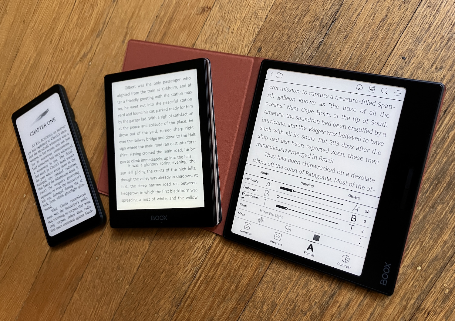
From left, the Palma, Poke 5 and Page. Image Credits: Devin Coldewey / TechCrunch
The situation for the mid-range Page reader ($250) is much the same as its smaller sibling the Poke 5, but the Page opts for the asymmetric look pioneered by Amazon’s Oasis (if I remember correctly). This popular form factor has seen many versions, and although I am partial to Kobo’s latest due to an ergonomic curve and extremely practical case, this slightly more severe rectangular style also has its charms.
The Page retains the simplicity of the Poke 5, though it has a seven-inch screen (1264×1680, also 300 DPI). It is a flat rectangle with flush display and a handle with page-turn buttons on one side and power on the bottom (or top if you hold it left-handed). A minor complaint I had about this one is that the buttons are sort of joined rather than separate, and the farthest end of the long buttons doesn’t depress, meaning you have to press a little toward the center. It’s not a big deal, but it’s a strange choice and somehow the opposite of the Kobo Libra 2, which depresses on the far end of the button but not the inward side. Maybe there’s some kind of esoteric UI debate here I’m not party to, but there it is.
The buttons and slightly larger screen would make this my choice for travel if only I could get a stand-up case for it. If Boox can make that happen, they’ll really be a threat. At $250, however, it’s again hard to justify this one over the competing Libra 2, which you can get with a folding cover for a bit less than that.
Size: Large (plus color)

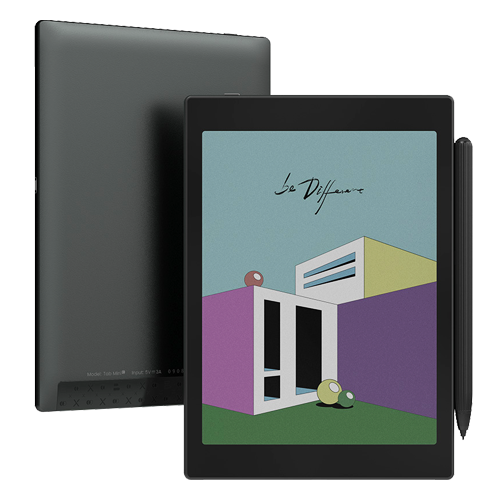
Image Credits: Boox
Boox also sent the Tab Mini C, which is the latest in their line of color e-readers, as well as a larger and more capable tablet with a stylus and pertinent productivity tools. Though this side of things has improved over the last few years, I still simply don’t see the utility in this class of device. The color is okay, but muted, making content like comics feel less exciting. I’m using their shot because mine all turned out bad.
The refresh rate isn’t fast enough to watch movies or TV, and although the stylus and sketching are extremely responsive, the compact size limits its usefulness as far as taking notes or annotating documents. It’s not that there’s anything wrong with the device, but that I can’t seem to identify who it is for, given its competition.
I look forward to a passive display with the kind of color we see in LCDs, but I’m worried after all these years that it may just not be possible. To be sure, this little tablet is much, much better than the ones I saw a few years ago, and certainly more responsive. But if you can have something dedicated to monochrome documents and notes like a Kobo Elipsa or reMarkable, or a color content master like the iPad, it feels like this class of device just doesn’t have a place in the lineup yet.


