Jaguar’s criticized radical rebranding makes consumers question how important products are to their identities
When Katja Vogt considers a Jaguar, she pictures a British-made car purring confidently along the Italian coastline — a vision of familiarity that conveys “that dreaming, longing feeling we all love.”
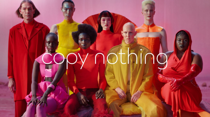
She’s not sure what to think about Jaguar now after the 89-year-old company announced a radical rebranding this week that featured loud colors and androgynous people — but no cars. Jaguar, the company says, will now be JaGUar. It will produce only electric vehicles beginning in 2026.
And say goodbye to British racing green, Cotswold Blue and black. Its colors are henceforth electric pink, red and yellow, according to a video that has received backlash online. Its mission statement: “Create exuberance. Live vivid. Delete ordinary. Break moulds.”
“Intrigued?” @Jaguar posted on social media. “Weird and unsettled” is more like it, Vogt wrote on Instagram.
“Especially now, with the world feeling so dystopian,” the Cyprus-based brand designer wrote, “a heritage brand like Jaguar should be conveying feelings of safety, stability, and maybe a hint of rebellion — the kind that shakes things up in a good way, not in a way that unsettles.”
Our brands, ourselves
Jaguar, a sturdy symbol of British tradition and refinement, was one of several iconic companies that announced significant rebrandings in recent weeks, upending a series of commercial — and, yes, cultural — landmarks by which many modern human beings sort each other, carve out identities and recognize the world around them.
Campbell’s, the soupy, 155-year-old American icon immortalized in pop culture decades ago by Andy Warhol, is ready for a new, soupless name. Comcast’s corporate reorganization means that there will soon be two television networks with “NBC” in their name — CNBC and MSNBC — that will no longer have any corporate connection to NBC News, a U.S. legacy news outlet.
One could even argue that the United States itself is rebranding a bit with the election this month of former President Donald Trump and Republican majorities in the House and Senate in a divided nation. Unlike Trump’s first election in 2016, he won the popular vote in what many called a national referendum on American identity.
Are we, then, the sum total of our consumer decisions — what we buy, where we travel and whom we elect?
Certainly, it’s a question for those privileged enough to be able to afford such choices. But volumes of research in the art and science of branding — from “brandr,” an old Norse word for burning symbols into the hides of livestock — say those factors do contribute to the modern sense of identity. So rebranding, especially of heritage names, can be a deeply felt affront to consumers.
“It can feel like the brand is turning its back on everything that it stood for — and therefore it feels like its turning its back on us, the people who subscribe to that idea or ideology,” said Ali Marmaduke, strategy director with the Amsterdam-based Brand Potential.
He said cultural tension — polarization — in 2024 is surging over politics, wars in Russia and the Mideast, the environment, public health and more, creating what Marmaduke said is known as a “polycrisis:” the idea that there are several massive crises converging and that feel scary and complex.
“People are understandably freaked out by that,” he said. “So we are looking for something that will help us navigate this changing, threatening world that we face.”
Trump’s “Make America Great Again” qualifies. So did President Joe Biden’s “Build Back Better” slogan atop his legislative plan. And Campbell’s soup itself — “Mmm Mmm Good” — isn’t going anywhere, its CEO, Mark Clouse, said in a statement. The company’s new name, Campbell’s Co., will reflect “the full breadth of our portfolio,” which for some time has included brands like Prego pasta sauce and Goldfish crackers.
When Jaguar is not a sleek movie-star car, what is it?
None of the recent activity around heritage brands has sparked a backlash as ferocious as Jaguar’s. It’s a company that has stood as a pillar of tradition-loving British identity since World War II.
The rebrand, which includes a new logo, is slated to launch Dec. 2 during Miami Art Week, when the company will unveil a new electric GT model. Jaguar said in its press release that its approach was rooted in the philosophy of its founder, Sir William Lyons, to “copy nothing.”
What it’s calling “the new Jaguar” will overhaul everything from the font of its name to the positioning of it’s famous “leaper” cat. “Exuberant modernism” will “define all aspects of the new Jaguar world,” according to the press release. The approach is thought to be aimed at selling fewer cars at a six-figure price point to a more diverse customer base.
The reaction, though, ranged from bewilderment to hostility. Memes sprouted up likening the video to the Teletubbies, a Benetton ad and — perhaps predictably — a bow to “woke” culture as the blowback intersected with politics.
“Grace. Space. Pace. That’s what you are supposed to be about,” tweeted @JonnyHorsepower. “I don’t know what the hell this ad (?) is about.” Replied @Jaguar, cryptically: “These are our Strikethroughs. Deliberate, graphical and linear.”
A Spectator headline declared that the Jaguar rebrand is “doomed” and that it had “killed a British icon.” But wait: “What if the rebrand turns out to be just a huge mockery of ‘woke’ rebrands?” wondered Bennie1289 on Reddit.
Marketing and branding designers pointed out that any rebrand should, at least, be easy for consumers to remember and understand. JaGUar stumbled over that test on Day 1.
“Correction, November 19th,” read a blurb under an article in The Verge. “A previous version of this article said only the ‘G’ and ‘U’ letters in Jaguar are upper case. The ‘J’ is also upper case.”


