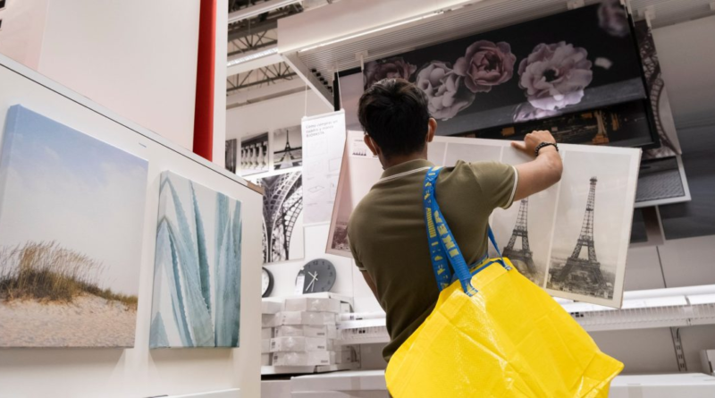
IKEA tried to do away with its maze-like structure to navigate its stores to help customers—except, they didn't want it
The quintessential IKEA shopping experience features a long and winding path from one section to the next until shoppers finally reach the check-out (and cafeteria that serves its signature Swedish meatballs).
For some, it’s an exhausting and time-consuming slog, and for them the retailer tried to change the design to make it easier for people to shop from specific departments.
But turns out shoppers love the maze and wanted it back.
The Swedish furniture brand has recently tried out a different design at some of its downtown locations across the world, one that looks like any other store where shoppers could go any route, based on what they want to buy. According to the Wall Street Journal, the new concept was designed to cater to casual shoppers or office-goers, who may not want to go through the gauntlet of walking through an entire IKEA store to buy just a few items.
But the gauntlet is exactly what customers seemed to want, interviews and surveys conducted by the retailer revealed. Shoppers wanted to be guided by the store throughout their shopping experience, Tolga Öncü, head of retail at Ingka Group, which operates much of IKEA’s stores, told the Journal.
“We thought we didn’t need to guide the customers because [we thought] the stores are so small we thought they would see everything,” Öncü said. “But it became very clear that [customers thought] ‘No, no, no, this is a big shop!’”
What made the maze-like format unique was also that shoppers found things along the way that they didn’t realize they needed. Customers were reminded of products they “talked about three weeks ago, but forgot,” Öncü said.
Designing for the new-age shopper
Choose-your-path stores were just one of the many formats that IKEA has dabbled with in recent years to appeal to the new-age shopper. The retailer has experimented with smaller stores and dedicated plan-and-order locations to complement the online shopping experience. It also continues to try with different design ideas for its downtown locations, which doesn’t offer the luxury of space quite that its suburban warehouse-like locations have.
The retailer shut down stores in Madrid, Shanghai and Warsaw where shoppers could opt for their own path. IKEA also closed its urban small store in New York last December due to low foot fall, but has opened similar locations in London’s Hammersmith area as well as in downtown San Francisco.
“We are feeling very confident in our city approach, it is very complementary to our existing Ikea presence in that market,” Öncü told Reuters last week. He cited the example of an IKEA store that opened inside a mall in Stockholm which has “contributed to a 50% increase in physical visitation.”
Ingka Group didn’t immediately return Fortune’s request for comment.
The store layout’s part in IKEA’s success
IKEA has been a household name for decades now. Its first store opened in Älmhult, Sweden in 1958. It now has 460 stores across 62 different markets as of February.
Its stores can span hundreds of thousands of square feet—and getting in and out of a store could take a while, if it’s designed the traditional way. The stores have shortcuts for those who want to head straight to billing. But the format has been key to IKEA’s success.
Furniture is often laid out in its natural setting and categorizing different sections can make shoppers feel like they’re browsing a physical catalog. Psychologically, the winding path appears to make shoppers want to keep going since they can’t see what’s ahead and don’t want to miss anything if they leave mid-way.


